How To
Pro Photoshop tips everyone can use: working with Adjustment Layers
- April 24, 2018
- Updated: July 2, 2025 at 6:31 AM
Perhaps the greatest single leap forward any beginner can make when starting out with Photoshop is learning to work with Adjustment Layers. In this easy-to-follow guide we explain exactly how.
Pro Photoshop tips everyone can use: working with Adjustment Layers
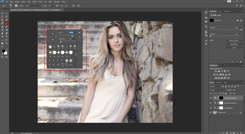
What is an Adjustment Layer?
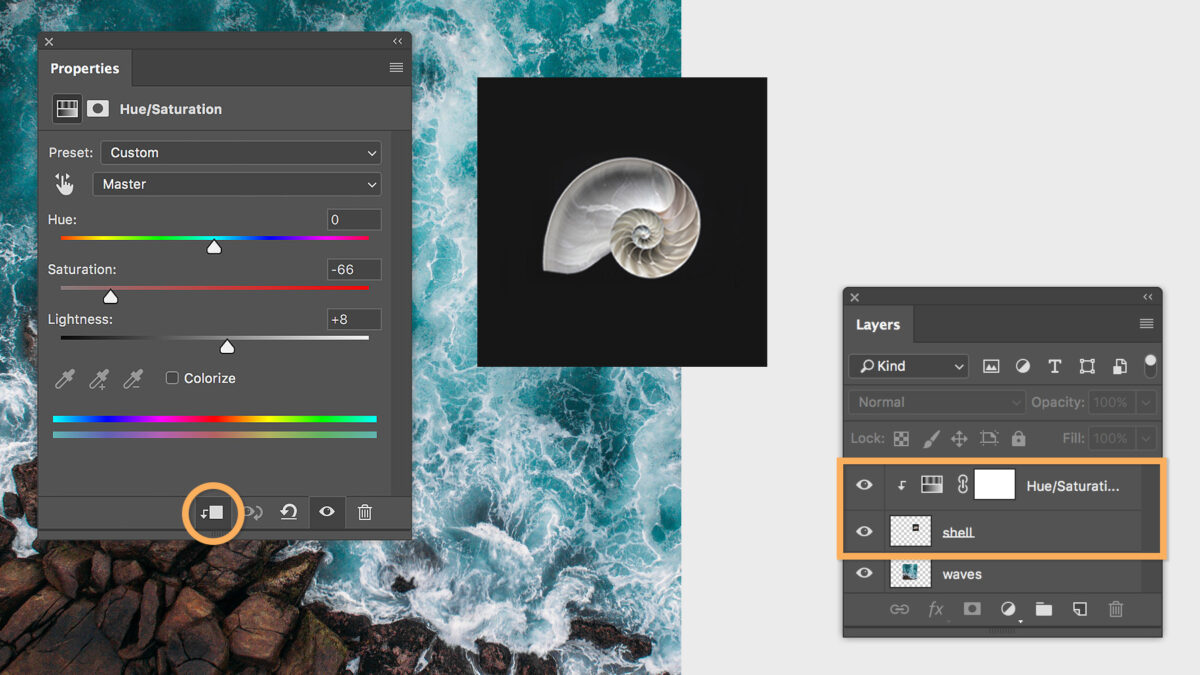
An Adjustment Layer is a transparent layer that is placed over an image in Photoshop to add an effect without making any destructive changes to the original photo below. An Adjustment Layer functions like a filter but with an added degree of flexibility and control.
Imagine sheets of acetate stacked over a printed photograph, each one altering the look of the photo at the bottom of the pile. As the acetate sheets aren’t permanently attached to the photo, they can be switched out for others, or shuffled into a different order.
That’s pretty much how Photoshop Adjustment Layers work: As Adjustment Layers are totally separate from the background image, you can keep tweaking them until you get the photo looking just how you want it. All without making any destructive changes to your original file.
This has three main advantages: the strength of the effect can be adjusted at any time by changing the opacity of the layer; an Adjustment Layer can be made to alter only a specific section of the image by adding a layer mask; and if you totally change your mind about the effect of an Adjustment Layer you can easily switch it off or even just delete it.
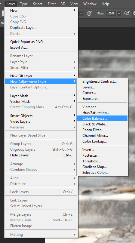
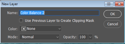
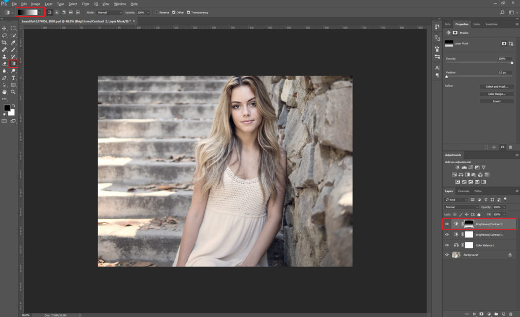
Going to Image > Adjustments > Color Balance would permanently change the colors of the background image. Instead you should go to Layer > New Adjustment Layer > Color Balance, where you’ll be prompted to choose a name for the Adjustment Layer. Now you can work on the colors of your photo, safe in the knowledge that the changes can easily be modified or discarded later.
For example, once you’ve made your adjustments to the colors, you can fine-tune the strength of the effect with the Opacity slider on the Adjustment Layer panel.
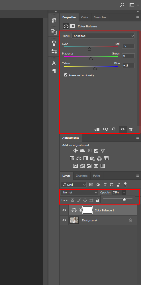
This is particularly handy if you come back to an image you were working on earlier, only to decide that you went overboard with the color adjustments and want to bring things back a little closer to how they were before. Drop the opacity to somewhere between the two, and you’ve got an instant compromise without having to re-do your work.
Up the contrast
Editing color is just one example of how you can use an Adjustment Layer. In fact, you should use Adjustment Layers for almost any photo editing task. Take the contrast, for example. Depending upon the lighting conditions when shooting, images straight out of the camera can often look a little flat and lifeless. This is especially true when photographing on a cloudy day or in the shade. Increasing the contrast will help to give a photo a little extra graphic impact, but effectively also reduces the amount of information in your photo. For this reason it needs to be done carefully.
Although Photoshop has an Auto Contrast function, this should generally be avoided, as it gives no control over the degree of contrast that will be applied to your image. On top of which, the Auto Contrast command is applied destructively to the background image, not as an Adjustment Layer, and so will permanently alter your original file. Never a good idea.
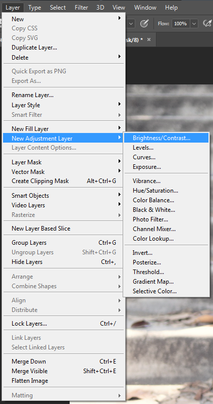
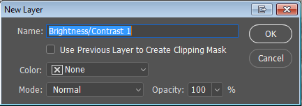
Instead, go to Layer > New Adjustment Layer > Brightness/Contrast, and once again choose a name for the Adjustment Layer.
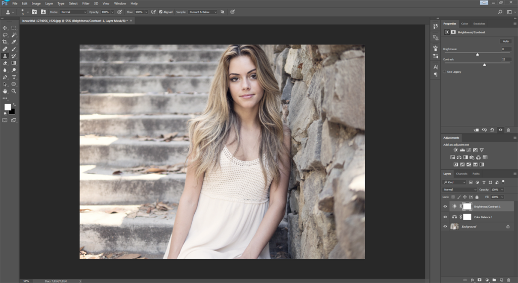
Now tweak the Contrast slider until you achieve the desired degree of punch.
More advanced users might want to go to Layer > New Adjustment Layer > Curves instead. The Curves panel offers a much greater level of control over adjustments to brightness and contrast, but is notoriously scary for beginners to use. (Learn more about Curves in this article.)
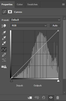
As with many Photoshop editing techniques, adjustments to the contrast of an image can easily be overdone – making your photos look trashy and amateurish. For a more sophisticated and technically accomplished look, pay particular attention to shadow and highlight areas when adjusting the contrast. Is there still some detail in the shadows, or have they all turned to black? What about the highlights, is info still visible there? Or have the highlights burned out completely, becoming just an empty white space?
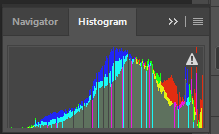
Subtlety is key: You’re looking for extra bite, but without losing too much information. To check for burned out areas, go to Window > Histogram, and a panel will appear displaying histogram information for your photo.
Dodging and burning
It’s rare that a photo isn’t significantly improved by a bit of creative “dodging and burning.” While Photoshop has dedicated Dodge and Burn tools, there’s actually a better way of achieving this using Adjustment Layers.
Before we get to that, though, what do we actually mean by the term “dodge and burn”? And what’s it used for?
The expression dodge and burn is a hangover from the days of analog film photography. It refers to the technique of partially blocking the light from a photographic enlarger in the darkroom – exposing some areas of the photographic paper for more (or less) time than others. This has the effect of making those particular sections darker (or lighter) than the overall exposure of the print.
Burning for Balance
There are several reasons why we might want to do this to a photo. First, the balance of an image is extremely important. Darker areas feel “heavy,” while lighter ones feel, well, “light.” For an image to appear balanced, our eyes expect to see heavier (i.e. darker) areas at the bottom of the frame. But as they don’t always come out that way when we shoot them, we’ll often need to give the image a helping hand in the editing stage. Similarly, if the main subject of the photo (for example, a person) is on the right side of the shot, then the composition might feel more balanced if some “weight” (i.e. density) is added on the left side in order to compensate.
The best way to do this is to create a new Adjustment Layer (Layer > New Adjustment Layer) either for Brightness/Contrast or, if you’re feeling brave, Curves. As we want this Adjustment Layer only to alter the exposure of the image – rather than the colors or anything else – we’ll also need to change the Mode setting in the Adjustment Layer panel from Normal to Luminosity.
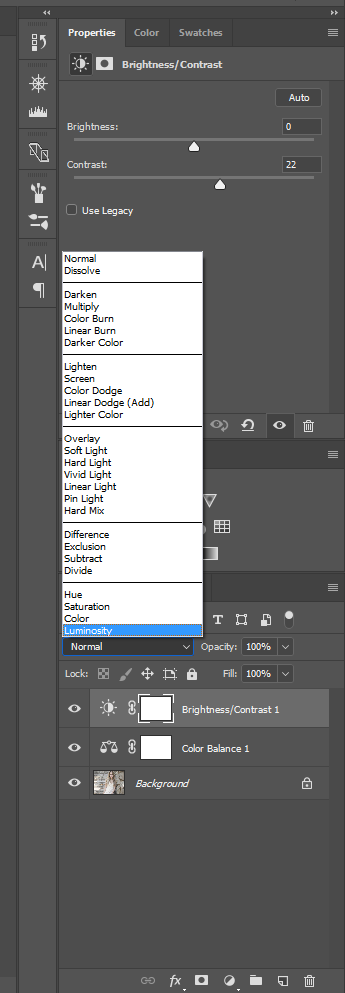
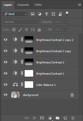
Let’s say we want to darken the bottom third of the frame to give a greater feeling of solidity and balance to the image. Our next step, then, would be to create a second Brightness/contrast Adjustment Layer (don’t re-use the first one we already made, though, as this would just undo its effects). Now move the Brightness slider left to the degree that you want to darken the bottom of the frame.
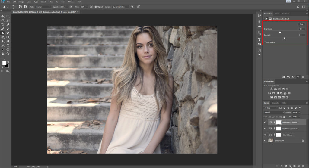
Of course, this darkens the whole image all at once. So now we need to select the area of the image we wish to mask from the effects of the Adjustment Layer (in this case the top two-thirds of the frame). Painting with black on an Adjustment Layer creates a mask which blocks that part of the Adjustment Layer so that it doesn’t have any effect on the background image. What we want to do now, then, is to select the bottom third of the image using the Gradient tool.
To do this, make sure the background and foreground are set to white and black respectively, and draw a line using the gradient tool descending from approximately the top 1/3 mark down to the bottom 2/3 mark. Now the effects of the Adjustment Layer will be visible only on the bottom part of the image, gradually fading out about a third of the way up.
![]()
If the effect is still too subtle – if the bottom part of the image isn’t dark enough – we have two main options open to us. The easiest solution is to move the Brightness slider further to the left on the Adjustments panel, darkening the bottom of the frame. However, the feathered gradient might not be gradual enough to handle this, and so the effect might become too obvious. If that happens, the alternative is to keep our first Adjustment Layer as it was, and then repeat the above process, only this time making the gradient begin a little lower down or higher up the frame. This way it will overlap with, but not exactly match, our first adjustment layer; likely making for a smoother transition.
We can go on stacking adjustment layers in this way as much as we need to, until we get a nice smooth gradient and the desired degree of burning at the bottom of the frame.
Vignetting
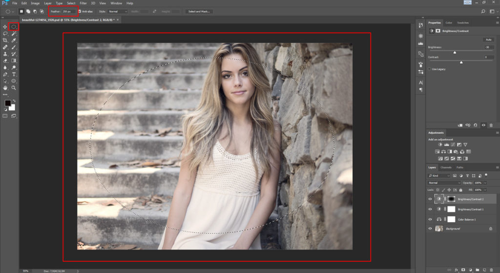
Another highly effective editing technique is vignetting; that is, subtly darkening the corners and edges of a photo while leaving the center normally exposed. This has the effect of drawing the viewer’s eye into the frame and can be achieved in exactly the same way that we added weight to the bottom of the frame in the steps above. Only this time we draw a circle with the Lasso or Elipse tool in the center of the photo so that the Adjustment Layer only alters the edges and corners of the frame.
You may need to experiment with the degree of feathering (gradient) here, as the exact results will depend upon the size of your image. In our example we feathered the selection by 250 pixels, but if you are working on a much larger file you may need to input a higher value here (the maximum amount of feathering Photoshop will currently allow is 1000px).
Be careful with this vignetting effect, though, as it is often overused and can look amateurish if applied heavy-handedly. Vignetting should be subconsciously felt rather than seen. As a general rule, if the effect is immediately noticeable, then it’s probably too much.
There’s no reason not to use vignetting in tandem with other burning techniques, too. For example, we might want to go for a subtle vignette and darken other areas of the image as well.
Focusing attention
Clever use of dodging and burning can also help to draw the eye toward the main subject of a photo by toning down distractions. For example, if a person is photographed in a busy scene, with a lot of competing information all around her, the viewer may be unsure where to look. By lightening up the main subject, or even just the face or eyes if the subject is a person, and burning down any bright or distracting areas of the foreground or background, there will be less information competing for the viewer’s attention. This way it will be more obvious precisely which element is the main subject of the photo, and its impact will be much greater.
Finally, dodging allows you to “pull up” any information that you want people to focus on, while burning can help hide imperfections or superfluous information that adds nothing to the photo’s “story.”
What’s the best way to do this?
Let’s imagine that we want to darken down one particularly distracting element in a photograph. There are various ways we can about go it, but perhaps the most effective is to create a new Brightness/Contrast Adjustment Layer and slide the Brightness control to the right to darken the image, just as we did above. This time, though, we don’t make a selection with the Lasso or Gradient tools, but instead immediately fill the entire Adjustment Layer with black using the Paint Bucket tool or by pressing Alt+Backspace (alternatively, Alt-click the Layer Mask icon) to add a mask that blocks the effect of the entire Adjustment Layer.
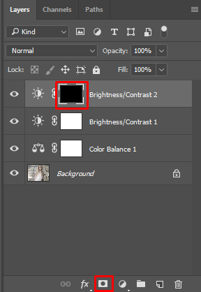
Now the effects of the Adjustment Layer are no longer visible anywhere, masked as they are by the black paint. But just as black blocks the effects of an Adjustment Layer, white reveals those effects again (or serves to delete the black, if you prefer to think of it that way). This means that if we now select the Paintbrush tool (right-click for options), with a moderately soft brush and pure white selected from the color palette, we can go in and effectively paint shadow onto the areas of the image that we want to darken down.
Be careful not overdo your edits in this way, though, as there is a risk that a photo can end up looking very fake and unnatural if the rules of light are not respected – in other words, if you start playing around with the balance of light between different elements of the image too much, highlights can end up darker than shadows and vice versa. This would result in totally improbable lighting, undermining the credibility of your photo and making it look more like an illustration than reality. Nonetheless, this technique is particularly handy for toning down small but distracting details, such as a bright button on a coat or an annoying highlight area.
But that’s not all
Good photo editing is often really just about problem solving. We’ve barely touched upon the many possible uses of Adjustment Layers here. All the same, the above techniques should have armed you with the sufficient skills and, perhaps most importantly, put you in the right frame of mind, to tackle all kinds of photo editing and retouching problems on your own. So the next time you’re faced with a particularly troublesome photo editing challenge, consider whether the creative use of Adjustment Layers might be the answer. That’s what the pros do!

You may also like
 News
NewsBungie announces a new beta for Marathon, although analysts are not very sure about the game's future
Read more
 News
NewsThe developers of Vampire: The Masquerade — Bloodlines 2 did not want to call their game Bloodlines
Read more
 News
NewsA player wants to check if the players of Arc Raiders are really peaceful… playing completely naked
Read more
 News
NewsThe developers of Helldivers 2 are working on their new game and already have a clear idea of what it will be like
Read more
 News
NewsCarrie by Mike Flanagan promises to be the most faithful adaptation of Stephen King's novel to date
Read more
 News
NewsTwenty years ago, the series premiered on HBO that would pave the way for Game of Thrones and The Last of Us
Read more